If you’ve been following the blog lately, you’ve seen the development of a number of models that are ultimately intended to help us predict team success. So far, we’ve developed:
- Points Predictor Model: This model uses team GF/60, GA/60 and GF% at 5 on 5 to predict point percentage.
- Team GF/60 Estimator: Uses player on-ice GF/60 and TOI/GP at 5 on 5 to estimate team GF/60.
- Team GA/60 Predictor: Model that uses team SA/60 and team SV% at 5 on 5 to predict team GA/60.
- On-Ice GF/60 Estimator (Forwards / Defensemen): Uses player goals/60, first assists/60, second assists/60 at 5 on 5 to predict on-ice GF/60.
- Team SA/60 Estimator: Uses player on-ice SA/60 and TOI/GP at 5 on 5 to estimate team SA/60.
While there is more work to do with the models to start predicting player performance, I think it’s time we take a break from model development and put our new tools to use. With the end of the regular season nearly upon us, we have an opportunity to use the models we do have to assess team performance from the 2020-2021 regular season. Let’s run through how we can use our models to accomplish this with data from Natural Stat Trick.
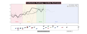
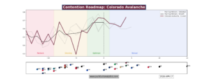
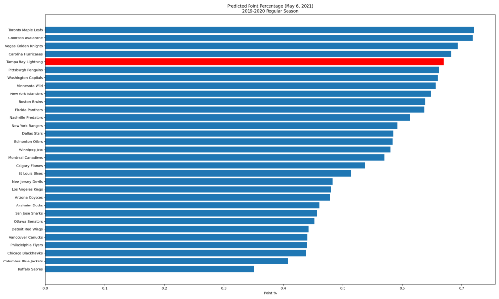
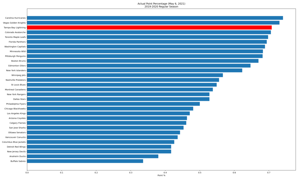
We’ll start by using the points predictor model to check actual performance against the model. This will give us an indication whether this year’s results had a large element of good or bad luck behind them. Let’s look at the defending Stanley Cup champion Tampa Bay Lightning as an example.
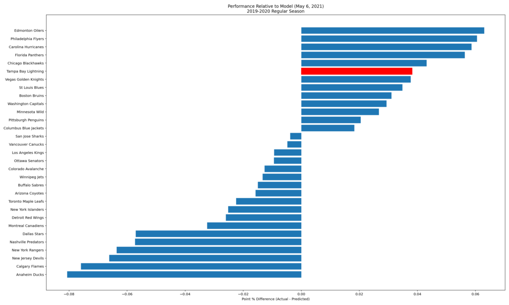
We see that the Lightning have outperformed the point predictor model this season. Outperforming the model may indicate they have some resiliency that helps them to win the close games, however it may also be more luck driven. Overtime and shootout results are a good example of how the 5v5 play we use in the model may not align perfectly with reality. Of course, a team that underperforms the model will be similar: they may have lost many of the close games or had some luck effects. Ultimately, we are interested in large discrepancies from the model, which may indicate that a team should expect somewhat different results next season if they were to ice the same roster.
How much did Tampa overperforming the model affect their place in the standings? When we look at the ranked point percentages for the season and the model below, we see that the model places the Bolts 5th overall and second in their division while they actually sit 3rd overall and 2nd in their division. So even if their luck turns and the Lightning’s future performance is closer to our model output, their overall standing is not likely to change much. Overall, our model sees Tampa Bay as an elite team just as they are in reality.
Since the points predictor model uses 5v5 GF/60, GA/60, and GF% as inputs, we can also look at these numbers to gain a better understanding of their performance.
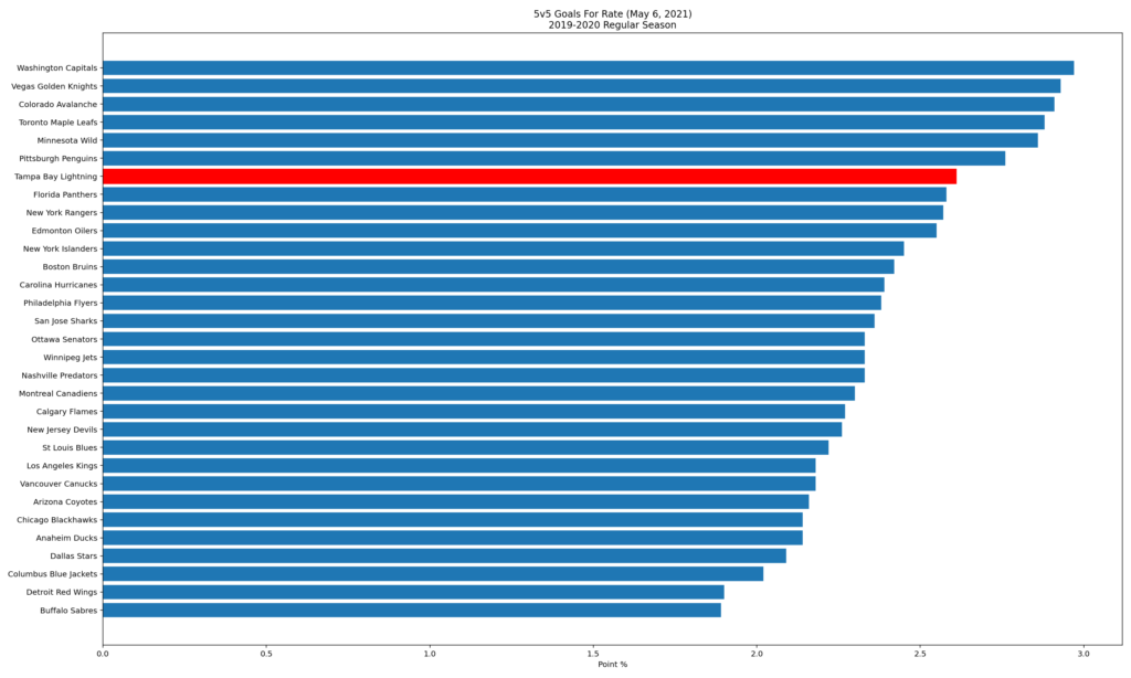
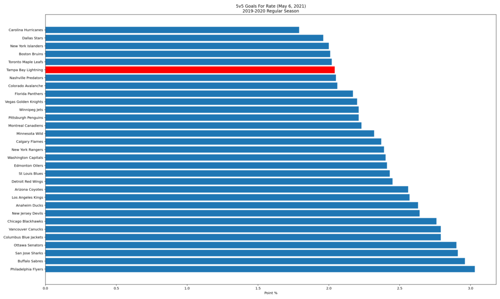
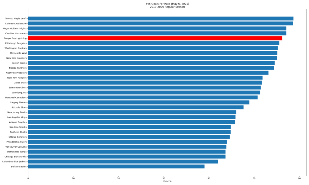
As we would expect with a high calibre team that has performed well, the Lightning are ranked near the top of the league in all three stats. From this high level, it looks as though the Lightning should attempt to minimize change in the offseason. Of course, free agency may make that difficult and there may be some targeted areas they should look to improve so we’ll start to dig deeper.
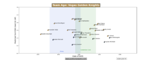
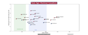
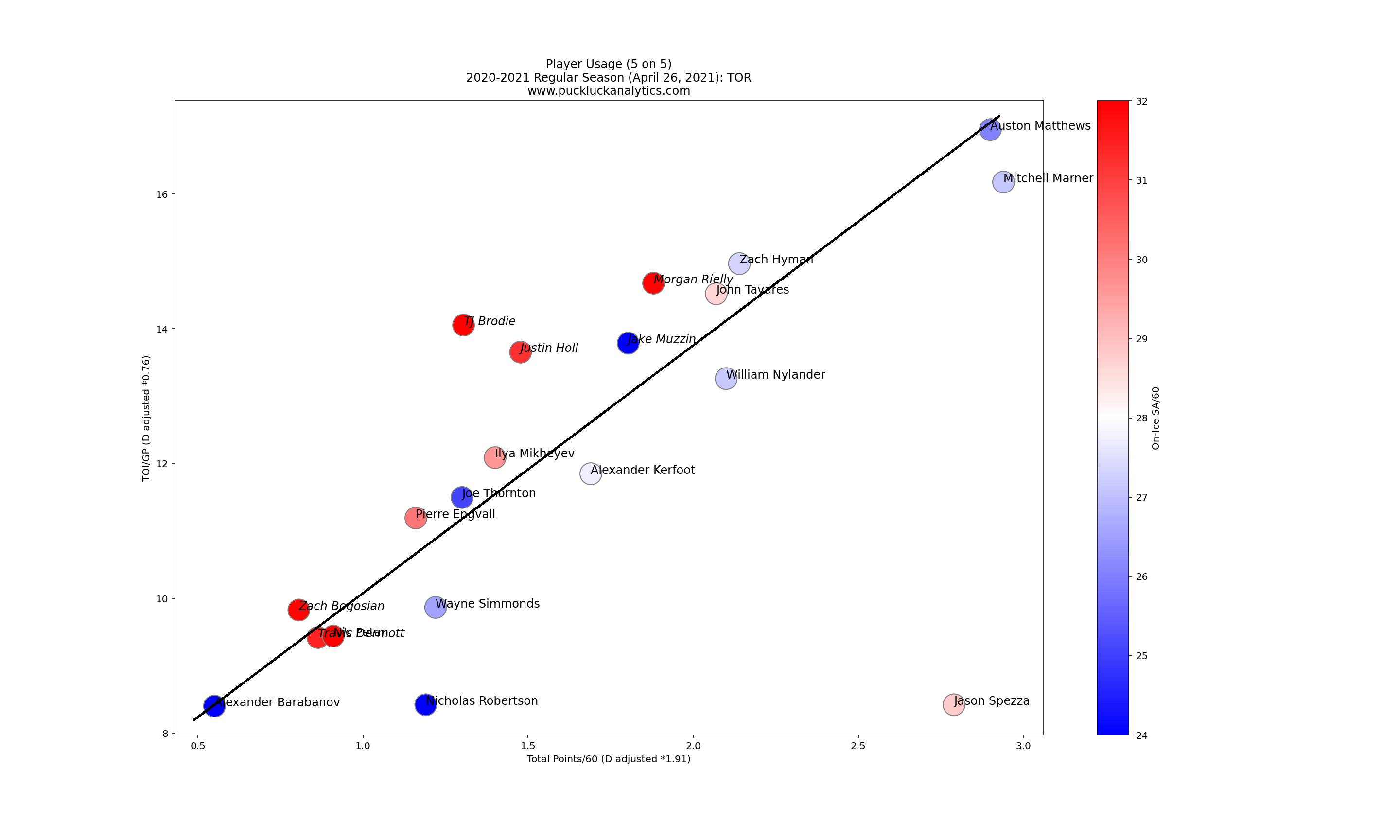
With team level stats out of the way, we can turn our attention to player performance. To get an overall view of the team, we’ll use a simplified player usage chart that includes the key inputs to our models. Total points/60 is simplified from the goal, first assist and second assist rates that we use in the GF/60 model and we use SA/60 as the skater impact in the GA/60 Estimator. Let’s look at a couple of samples to identify what we are looking for in the charts.
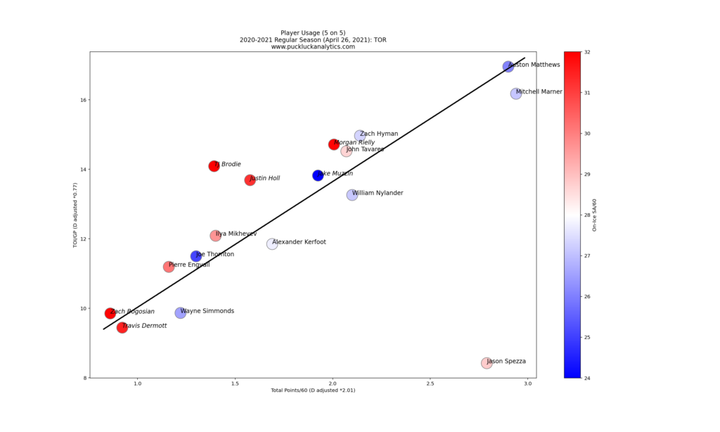
Defensemen points and time on ice have been adjusted to be comparable with forwards based on league wide totals. Ideally, these charts should read like an organizational depth chart, following a diagonal from top right to bottom left as seen above. The Toronto Maple Leafs are a great example, with little spread from the diagonal line. This indicates that the players they had were utilized in appropriate roles.
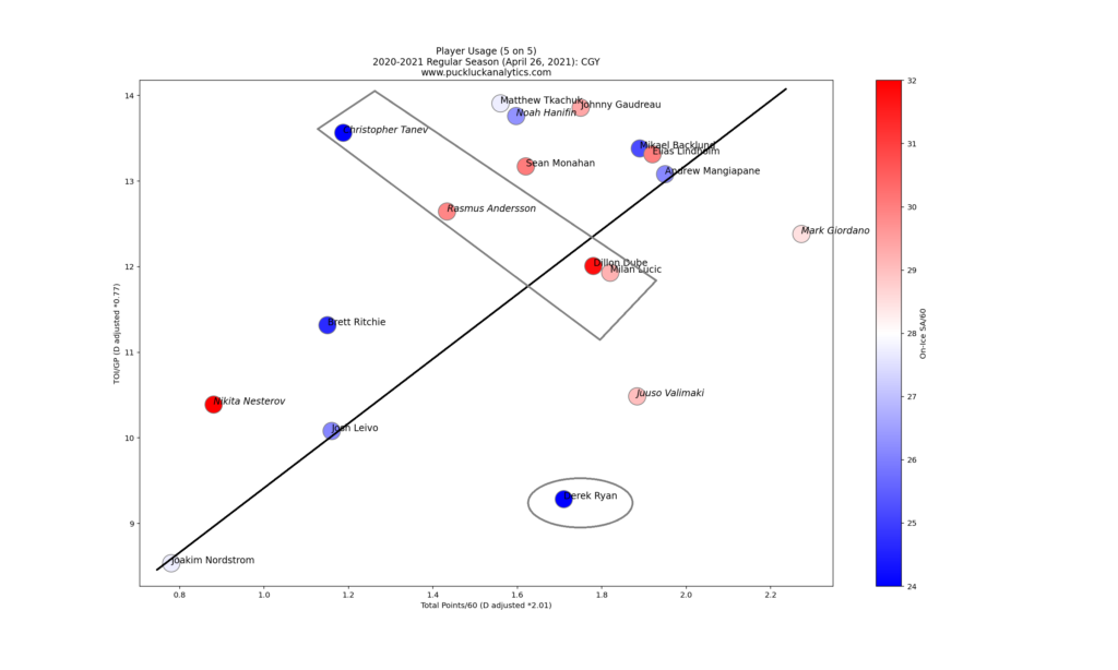
The Calgary Flames provide an example where players could possibly be utilized more effectively. Players above the diagonal line may be over-utilized since their point production is not in-line with their ice time. Likewise, players below the diagonal line may be under-utilized. We should, however, also consider the defensive impact of a player. In a case like Chris Tanev, we see he has a strong defensive impact that can help explain why he received more ice time than his offensive production would suggest he should. If we look at players grouped perpendicular to the depth chart line near Tanev, we see players to the upper left with better defensive defensive impact. If we see the opposite of this, it may indicate further issues with player utilization. Derek Ryan is a perfect example of a player who looks under-utilized. Falling well under the depth chart line, his offense suggests he could be utilized more and his defensive impact is also strong.
Next, we can look at GF/60 and TOI/GP. These are the two components we use in our team GF/60 estimator and give us a visual of the offensive impact that each player actually had. While forwards and defensemen are depicted together, we need to remember that their combined impacts are estimated separately.
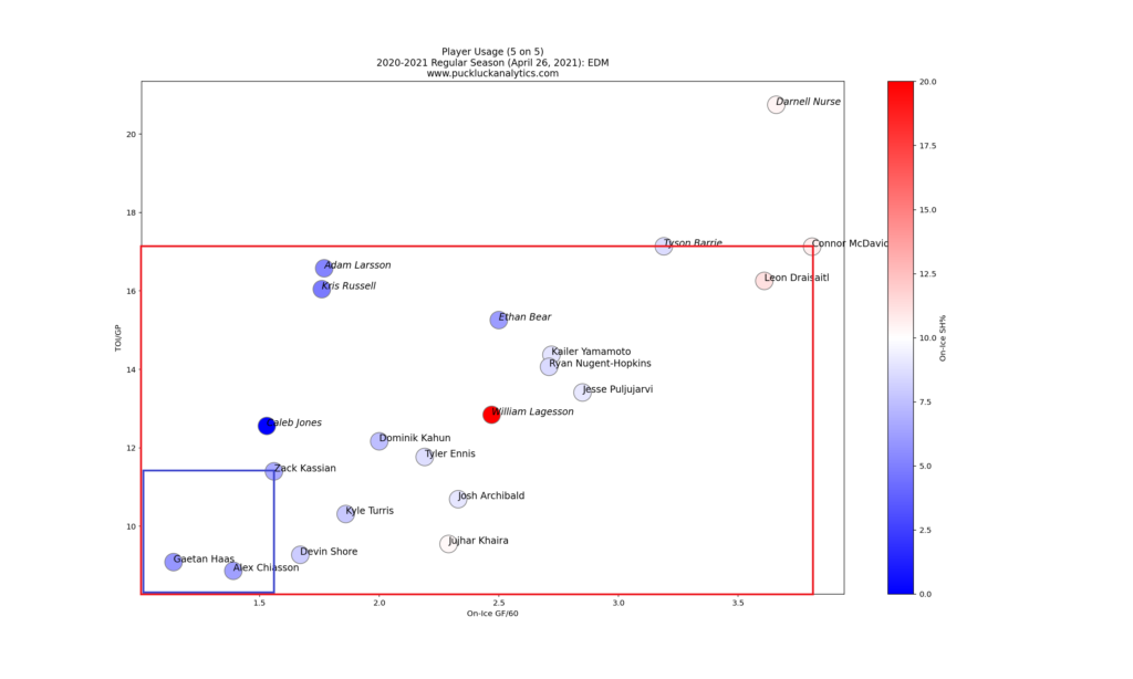
We can see the contribution to the Edmonton Oilers offense depicted above for Connor McDavid and Zack Kassian. The area in the box depicts McDavid’s contribution to the GF/60 weighted average for Oiler forwards. At a team building level, maximizing the size of the largest 12 boxes for forwards and the 6 largest boxes for defensemen is the objective. Comparing the size of the squares, we see why the Oilers rely heavily on a few elite players for their offense. Keep in mind that the scale on the plot doesn’t start at zero when comparing these boxes: the difference is not as large as it looks here since the bottom left corner of the boxes is actually at 0 GF/60 and 0 TOI/GP.
Similarly, we can look at SA/60 and TOI/GP to visualize the individual impacts to the SA/60 estimator. Again, forwards and defensemen weighted averages are calculated separately before being combined into a team total.
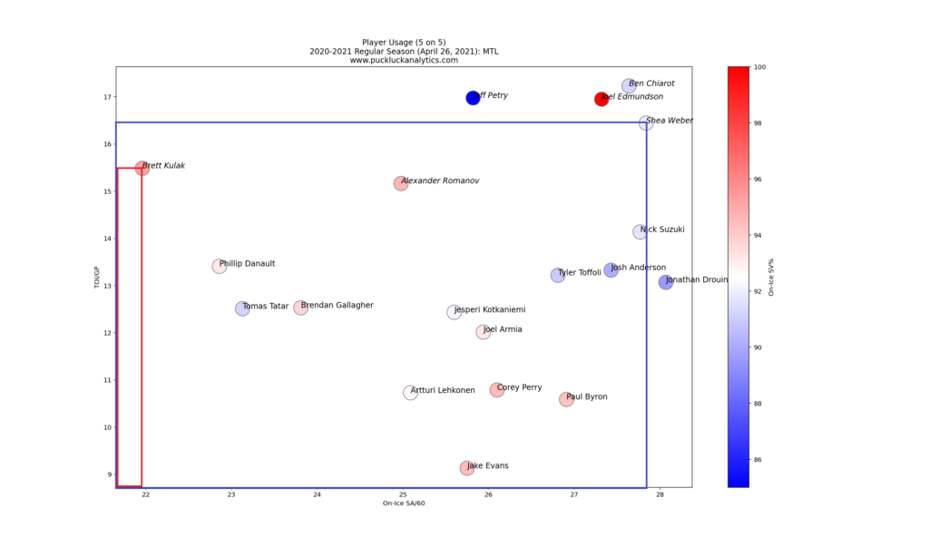
This time, the goal is to minimize the area under the squares at a team building level. Brett Kulak give us an excellent example of a player with a strong defensive impact. We can see here that although he plays only about one minute per game less at 5 on 5 than Shea Weber, his contribution to the team’s SA/60 is much smaller. Keep in mind that the scale on the plot doesn’t start at zero when comparing these boxes: the difference is not as dramatic as it looks here since the bottom left corner of the boxes is actually at 0 SA/60 and 0 TOI/GP.
Having looked at the actual performance of the players, we can turn our attention to the GF/60 Predictor to gain an understanding of how repeatable player performance was. In combination with the charts we looked at above, we can get an idea of which players could take on larger roles next season and which may need to have roles scaled back.
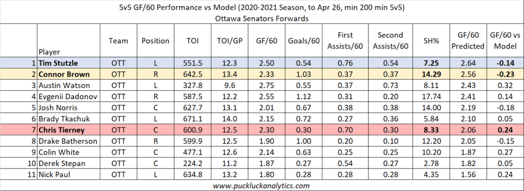
The Ottawa Senators forwards provide an example of both over and under performing players relative to the GF/60 Predictor. Tim Stutzle underperformed the model and had a pedestrian 7% shooting percentage. This indicates he carried his line mates offensively and may be poised for a larger role next season. We need to be cautious of shooting percentage since we use goal rates as input to the GF/60 model. Connor Brown’s comparison to the model is similar to Stutzle’s, yet his 14% shooting is likely to regress. In this case, the model prediction is likely on the high side and Brown may be good fit in his current role. Of course, we can look for players that are in over their heads a bit as well. Chris Tierney overperformed the model with a relatively average shooting percentage. He may be a better fit in a slightly lesser role.
Let’s look an example for defensemen.
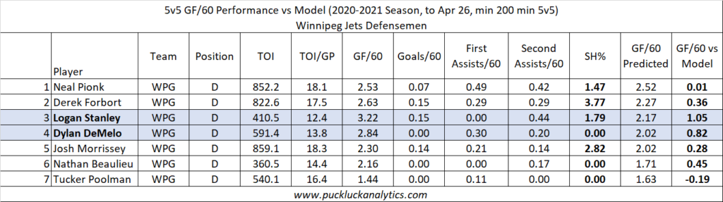
The Winnipeg Jets rely on their forwards to carry the offense. We can see this by looking at their defensemen as a group. Generally, the Jets’ Dmen are over-performing the model indicating that their team mates carry the offense while they are on the ice. For the most part, performance is near the model and isn’t a cause for concern. Logan Stanley and Dylan DeMelo stand out at the possible exceptions, with very large discrepancies from the model. It would not be surprising to see their on-ice GF/60 drop toward the model prediction in the future.
We also need to look at goaltending. Here we will look at the performance of the starting and backup goaltenders, as well as the workload split between them. Large discrepancies between starter and backup may hint at improvement that may be realized in the playoffs when the backup sees less action and risk if the starting goaltender goes down with an injury.
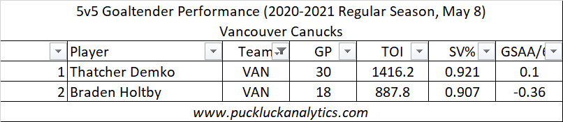
In the above example, we see that Thatcher Demko carried the load for the Canucks this season and outperformed Braden Holtby. Demko certainly looked like a quality starting goaltender and helped the Canucks back into the playoff race prior to their covid outbreak. Holtby’s performance was certainly at a lesser level than Demko’s and the Canucks would have reason for concern if Demko were out for a lengthy period of time.
Finally, we’ll look ahead to the offseason. We’ll look at the players who are set to become UFA or RFA that may lead to gaps in the lineup and we’ll use the findings from the season review to identify areas that the team should focus on improving.
I’m looking forward to putting these tools to use and I hope you are as well. Subscribe to ensure you don’t miss any of the reviews.