In my last post, I explored some differences in key 5v5 metrics that lend some insight into which teams have playoff resilient rosters. We walked away with 5v5 high danger Corsi rates identified as an indicator of a how well a roster will hold up against difficult opponents in the postseason. In this post, we’re going to look at a way to visualize roster depth with this concept in mind using the HDC Rate Contribution Worm.
To make sense of the HDC (high danger Corsi) Rate Contribution Worm, we need to recall the results from the last post on playoff roster resiliency. We found that there is a consistent, measurable impact on 5v5 high danger Corsi rates in the playoffs. Teams are able to keep their 5v5 HDCA rate stable from regular season to playoffs (there may be a small corresponding increase in low danger shot attempts, but teams clearly focus on negating high danger chances). Meanwhile, teams see their 5v5 HDCF rate drop in the playoffs. Presumably, this is because they come up against other strong teams who are better at consistently defending against high danger offense creation.
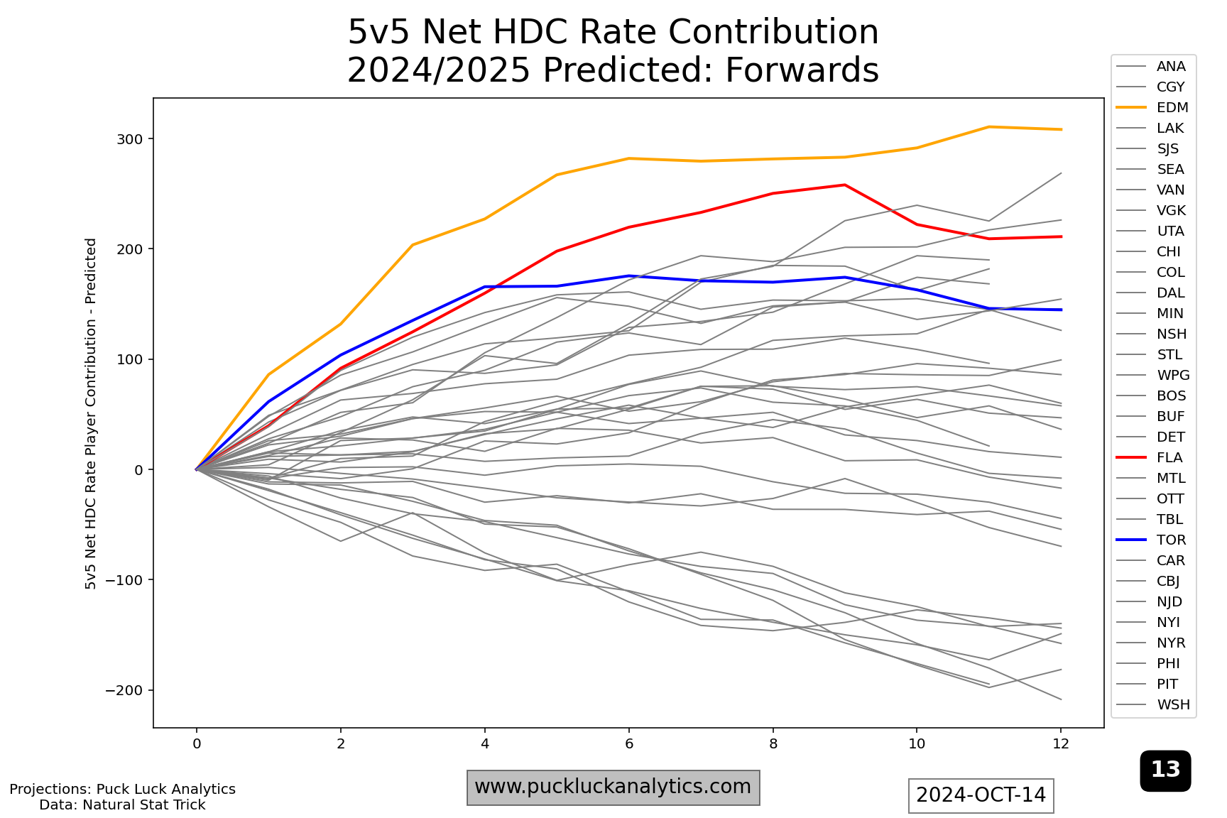
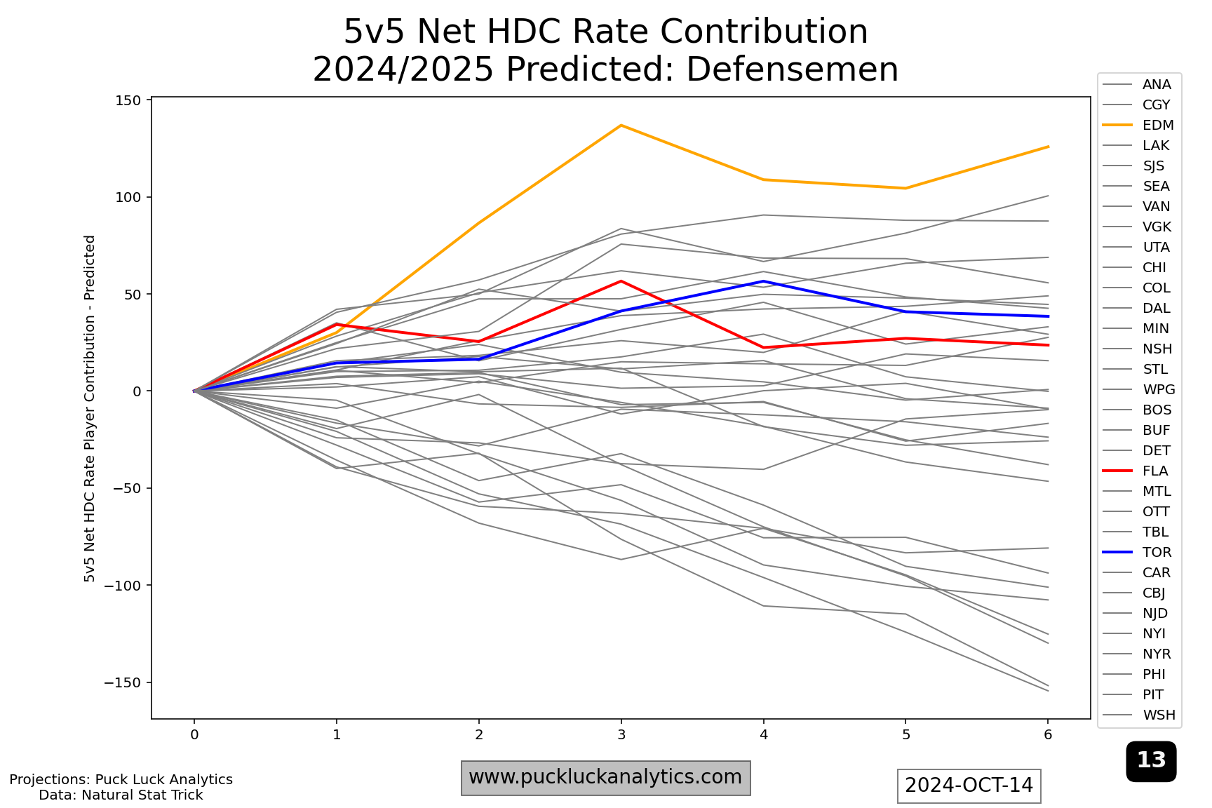
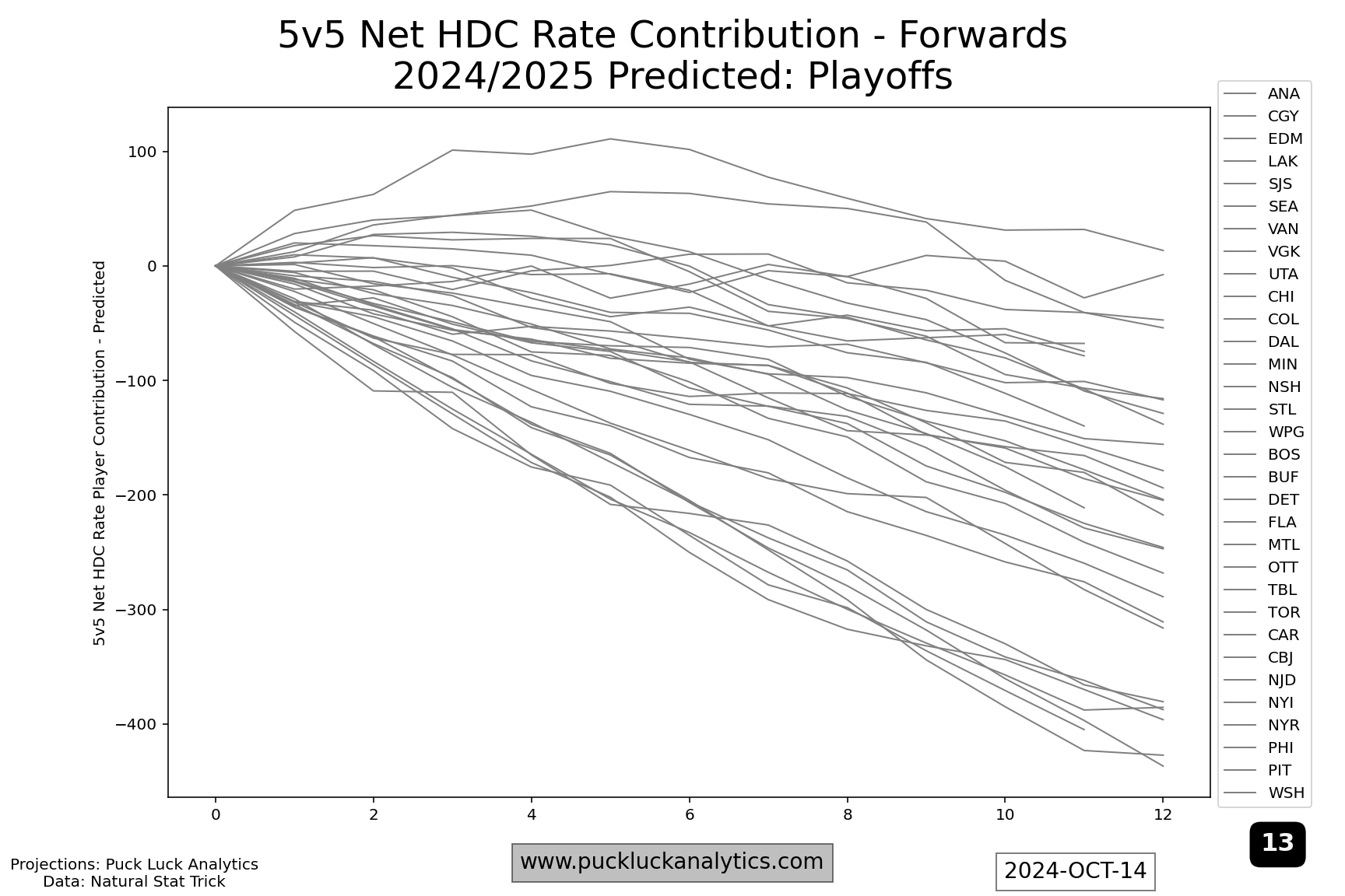
HDC Rate Contribution Worm
In the end, it’s the net effect of a reduction in HDCF offset by a stagnant HDCA as teams move from the regular season into the playoffs that we’re interested in. So we’re going to look at it from that perspective, using net 5v5 on-ice high danger Corsi rate. We can get a rough idea of each players contribution to the team rate by weighting their on-ice HDC rate by their ice time. We’ll do that simply by multiplying the two numbers to get their HDC Rate Contribution. We then sort players by ice time and cumulatively add the contributions, giving us the HDC Rate Contribution Worm.
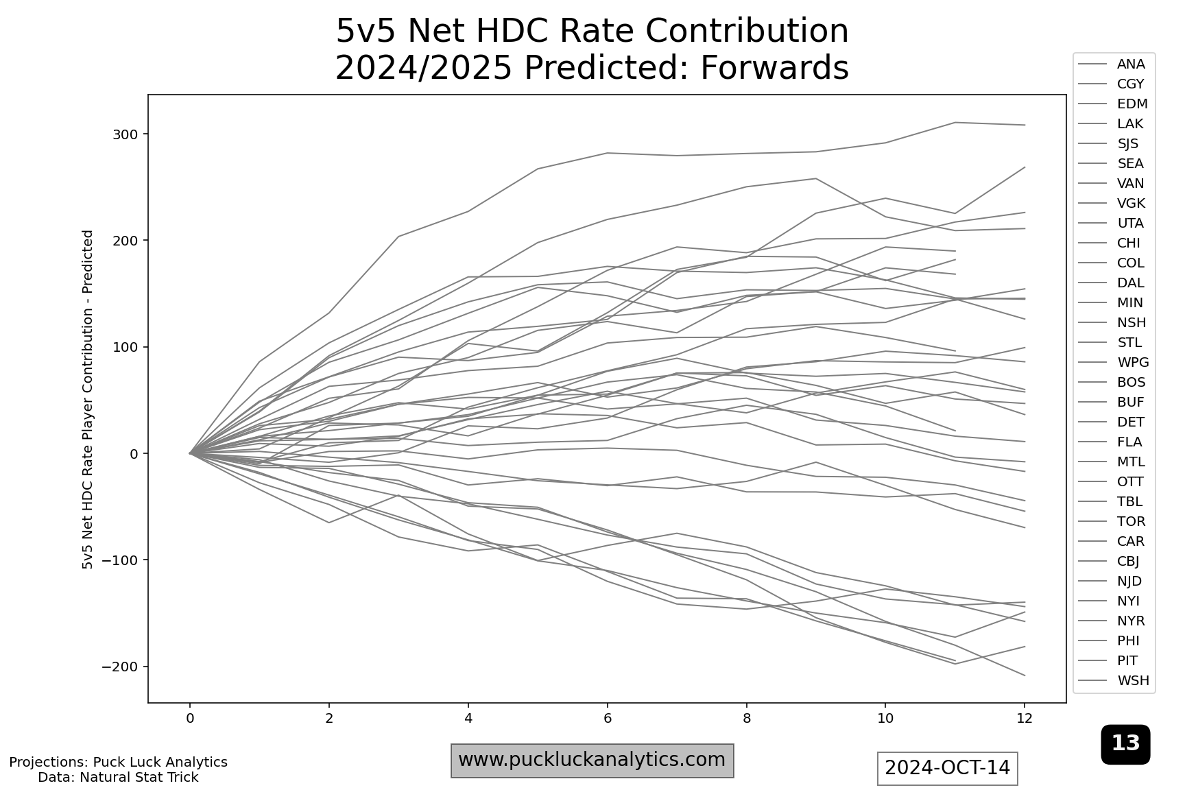
Here, I’ve put all 32 teams on a single graph to show the variety in outcomes. There are a couple of things we’re interested in for each line. First, the magnitude at the right hand side. This is the magnitude of the net HDC Rate Contribution for the top 12 forwards on the depth chart (the few that are short are due to rookies not yet in the model) and it’s the first check here for contenders. Contenders should be high on the right side. Second, does the worm steadily rise from left to right or does it include flat spots or drops? Flat spots or declines indicate weak points in the roster, which may be masked over in the regular season will be exaggerated come playoff time.
Using the results from the roster resiliency post, if we reduce HDCF rate by 15% for the playoffs and hold HDCA rate steady, the worms shift lower. Flat spots become declines. Declines are exaggerated. Weak points in the roster become more obvious and, if their playoff opponents game plan well, could mean the end of a team’s season.
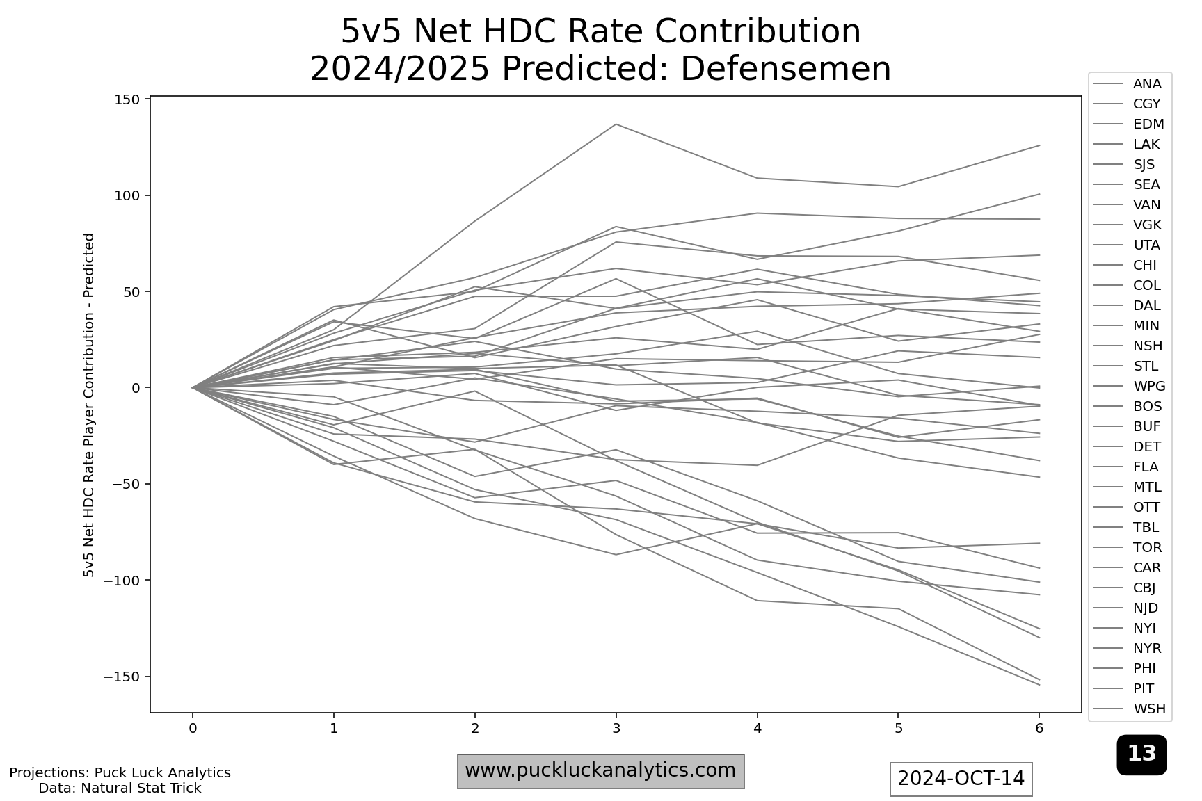
We can, of course, do the same exercise with defensemen, with similar results. When we look at playoff roster resiliency, we need to consider both forwards and defensemen.
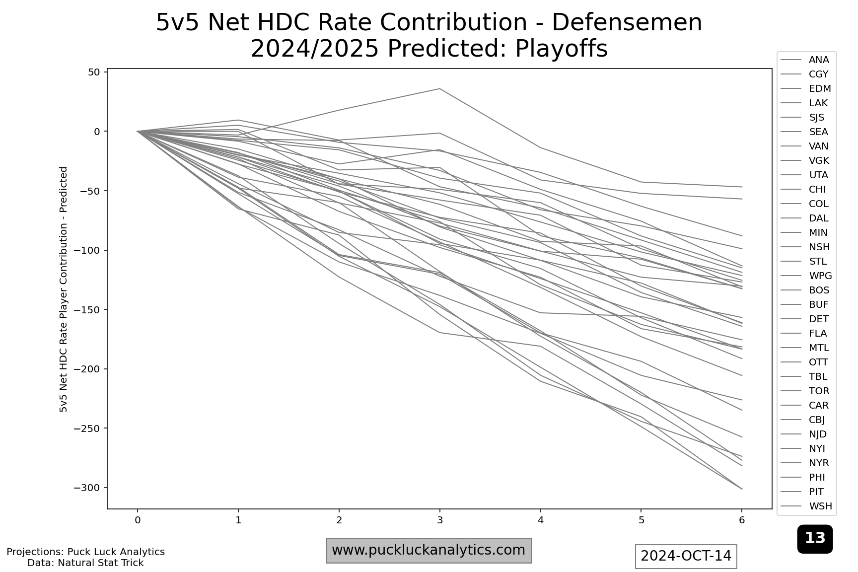
One caveat here is that the HDC Rate Contribution Worms are not the first place to go to identify contenders. Rather, they are a tool to try to separate contenders from each other. Teams that have strong predicted results in the regular season model are the starting point. They can then be compared against each other with these plots to gain some additional insight on how they may match up.
Example – Florida Panthers
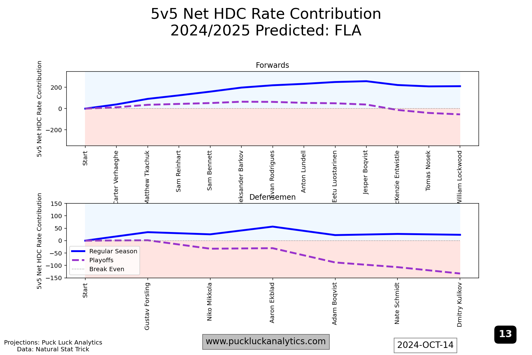
The defending champion Panthers are clearly one of this season’s contenders and they have one of the stronger looking HDC Rate Contribution Worms. At forward, their regular season worm trends steadily up until the 10th forward on the depth chart (by predicted TOI/GP). Their defense has a bit of a question mark with Adam Boqvist at #4 but is generally fairly strong. Perhaps Boqvist or another internal option steps up over the course of the season but, if not, the Panthers should probably target that spot for a trade deadline upgrade, along with improving their bottom end forward depth.
Example – Edmonton Oilers
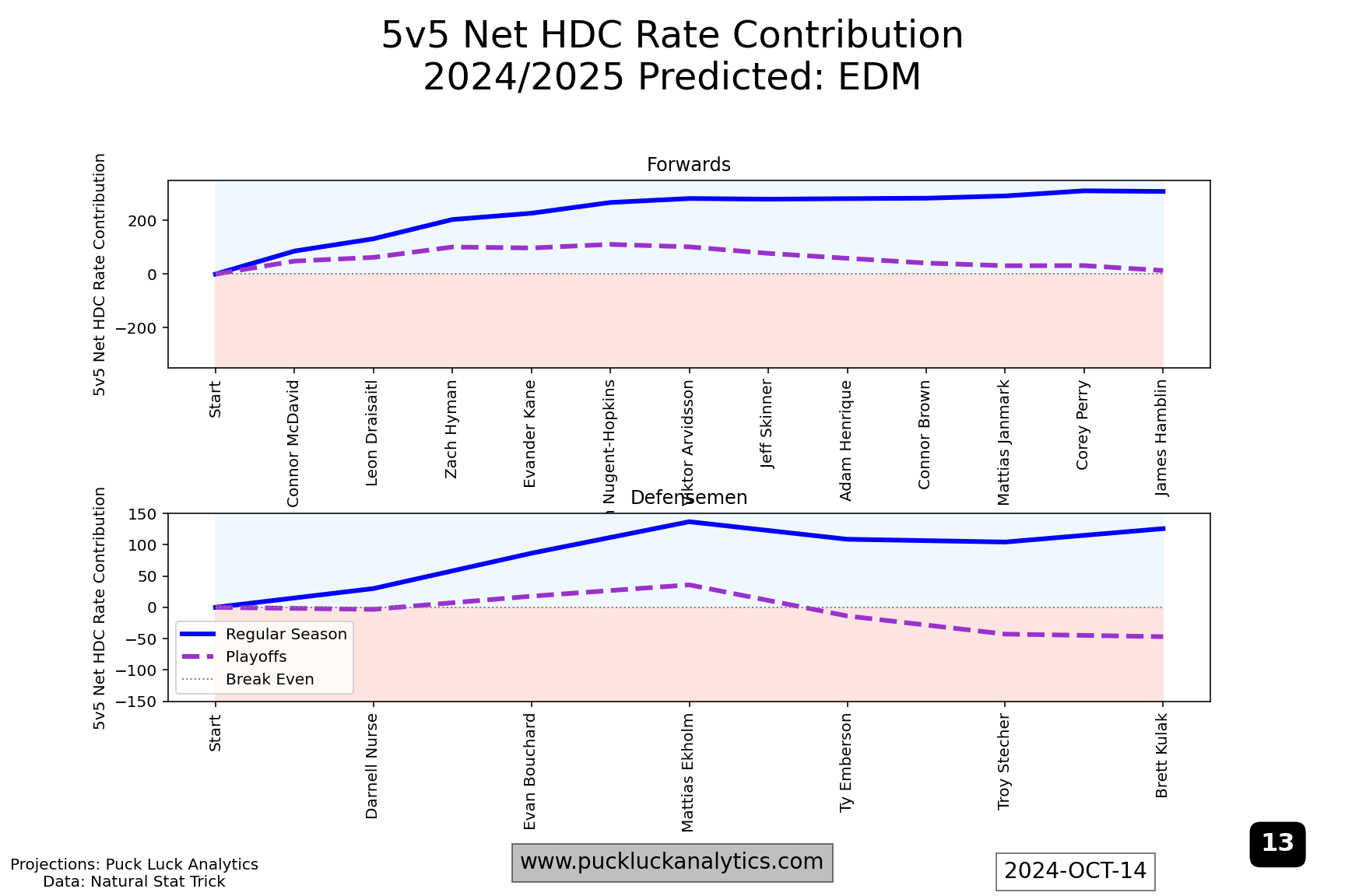
The Oilers high flying offense took them within one win of the Stanley Cup last spring and they have much the same group back this season. Their top three defensemen are a huge positive, but there’s a decline through #4 and #5 even on the regular season chart. That could be problematic in the playoffs as it suggests a similar outcome as last spring when their 2nd pair struggled. Relative to the Panthers forward group, the Oilers forwards worm levels out earlier- around #6/7. While the Panthers worm suggests they might be able to deploy their top 3 lines in the playoffs without much concern, the Oilers looks more like only the top 2 lines may stay over 50% 5v5 HDCF%. A top four defensemen and top nine forward help should both be on the Oilers trade deadline wish list.
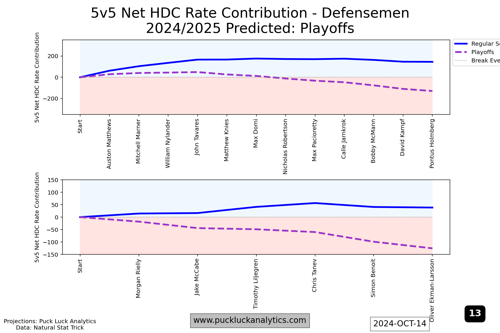
Example – Toronto Maple Leafs
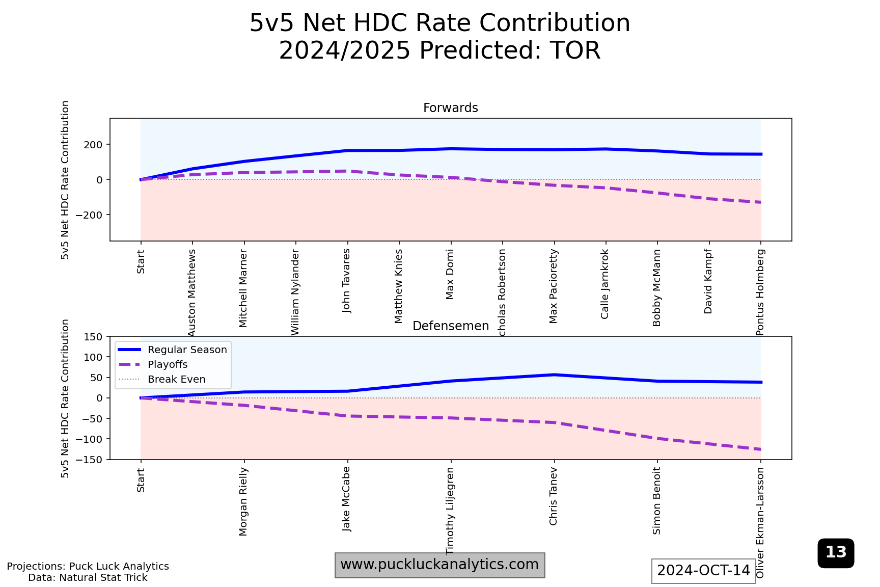
After both last year’s cup finalists, I included the Toronto Maple Leafs as a third example because they are the top rated team in the 2024/2025 model as of the start of the season. Still, their HDC Rate Contribution Worm show issues that could be more problematic in the playoffs than the two other examples. Their forward worm flattens around #5 on the depth chart. That means, come playoff time, they’re expected to be fighting a sub 50% 5v5 HDCF% for lines 2-4. A relatively flat start to the defense worm is the other issue that jumps out. The top pair will see the most ice time, potentially against the toughest competition, and having them run a net high danger Corsi deficit could be costly. Trade deadline targets should include a top pair D and middle six forwards, both with an considerable attention on high danger Corsi contributions.
As a final note, here are where the three teams above are relative to the rest of the league: