I’ve been sharing team and player cards for the 2024-2025 season for a while, but I haven’t yet put together a post explaining the new features of the model or cards. If you’ve been wondering about something on the cards or just want a deeper understanding, read on.
Team Profile
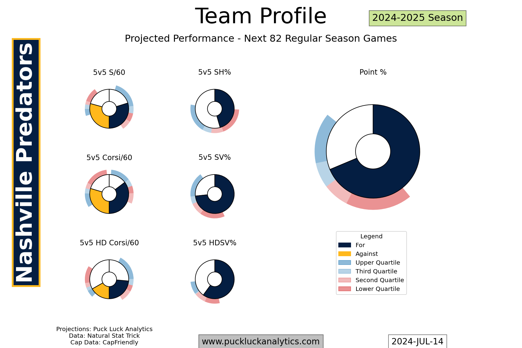
The Team Profile give an overview of the projected team stats for the 2024-2025 regular season. It’s actually a projection for the next 82 regular season games, which will make a difference once the season gets started. Look at these plots as how a team is most likely to perform in the future.
Projected point percentage is obviously the primary output from the model, helping put together the projected standings. The other team metrics shown are the key inputs that go into the P% projection model. This season, I’ve moved away from using xG rates as input. Instead, I’ve focused on more countable stats to avoid the variation that’s inherent in different xG models.
The main donut shows the target team’s projected stat from the model. The outer donut with the red and blue markers is a comparison to the rest of the NHL. Split into quartiles, there are 8 teams in each group. We can see here that the Predators are in the middle of the third quartile for projected P%. That puts them solidly in the top half and they should be expected to be in the playoff picture.
The possession based stats provide another wrinkle, showing rates for an against on the same donut. The scales on each half are set to match, so you can see at a glance if the combination puts a team over or under 50% share.
Player Profiles
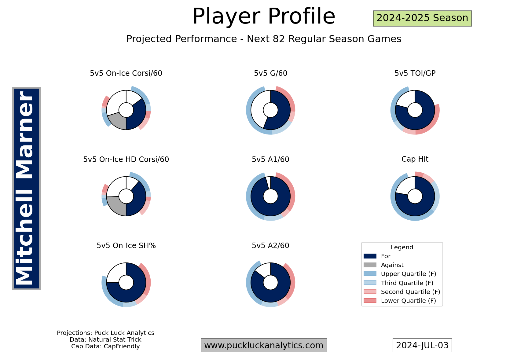
The player profiles work the same way as the team profiles, with a set of donut charts outlining key projected stats for each player. As in previous years, the projected player stats are the building blocks for the projected team stats and they feed into the team profiles. League comparisons are to the respective group of players, either forwards, defensemen, or goalies.
Cap Cliffs
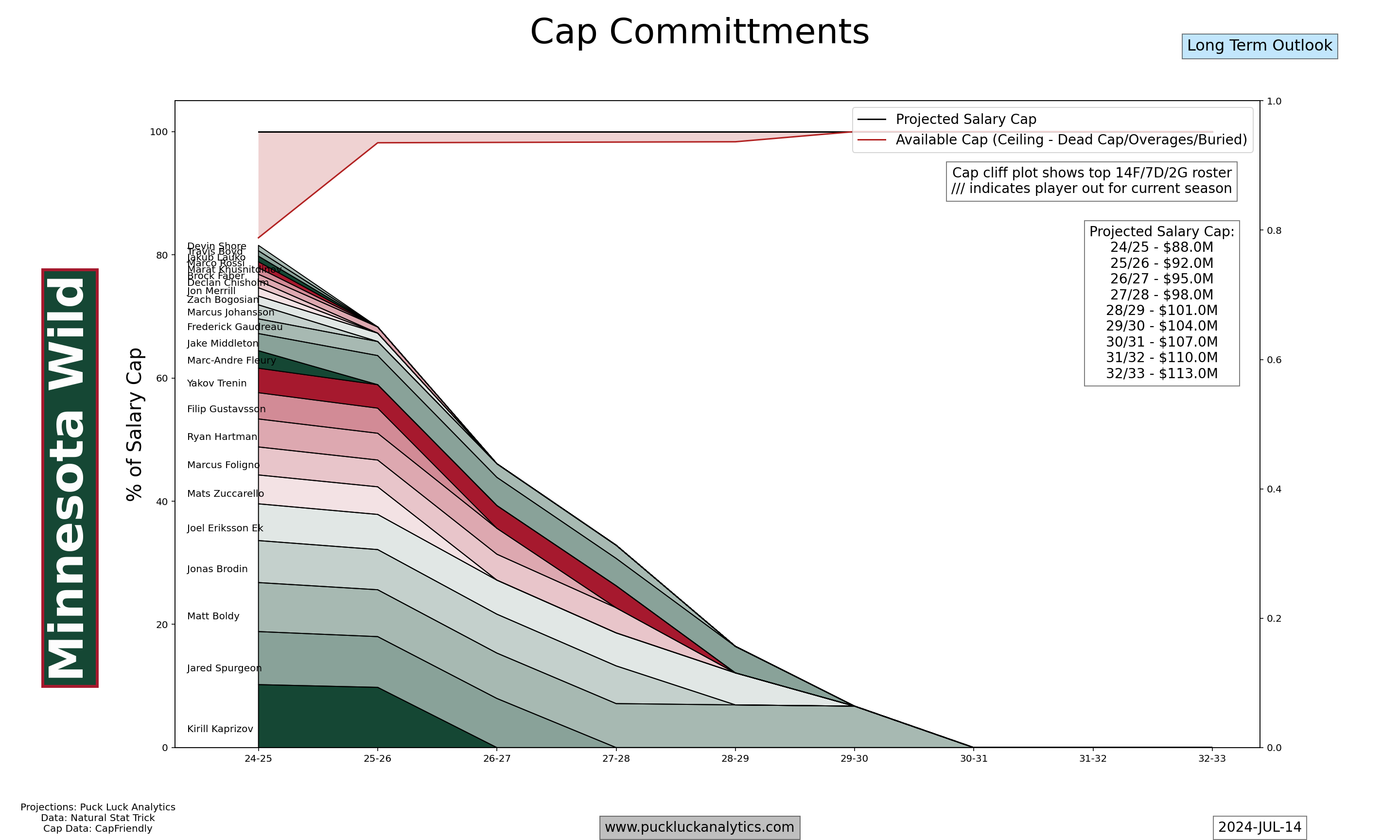
Cap cliffs give an overview of a teams general cap situation. A 23 player roster is included to show what the cap value of that group of players is. Dead cap from bonus overages and buyouts is also shown to indicate when a team has additional cap constraints. It is possible to see the team cap total exceed the ceiling, indicating the team could field a roster worth more than the cap ceiling depending on how they manage details of their cap situation throughout the season (LTIR is the most obvious example).
Starting Lineup Cap Profiles
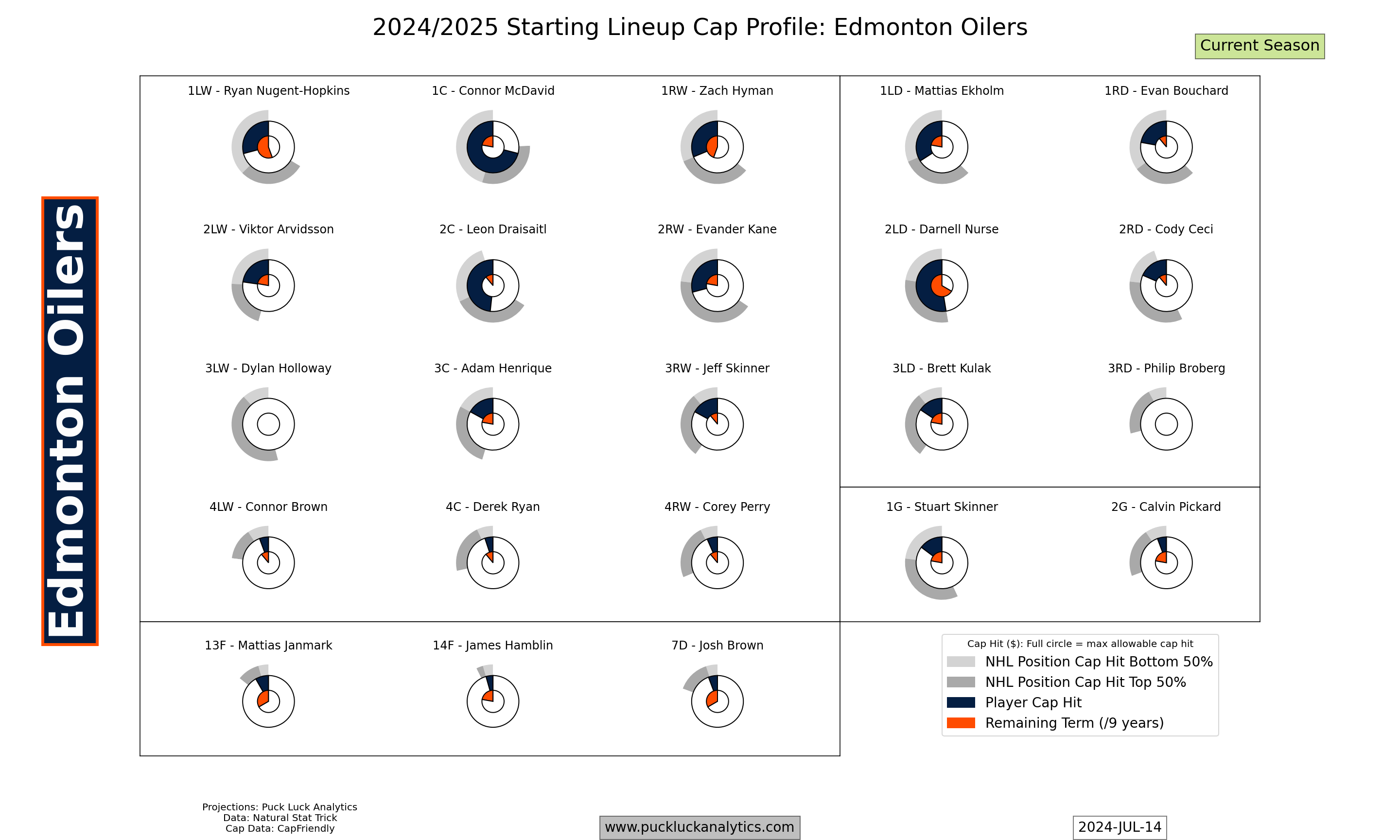
The lineup cap profiles include donut charts that work in a similar manner to the ones on the team and player profiles. The difference here is the comparison is to only the other players slotted into the same position in the lineup. The cap donuts are scaled so a full donut represents the maximum allowable player cap hit under the CBA. The inner pie shows the remaining number of seasons a player is under contract for. With the potential for 8 year extensions signed 1 year before they come into effect, a full circle is 9 seasons.
On the Oilers chart here, we see Darnell Nurse slotted in as the team’s 2LD. Compared to other 2LDs across the NHL, he has the highest cap hit. In the center, the 6 years remaining on his deal leaves the orange pie two thirds full.